ICON iOS16 chevron

The Introduction

ICON-BUBBLE literature
Overview
I had the rewarding opportunity to be a part of the team which redesigns the Travis Christian Assembly’s church website, a local Asian American church in Austin. From research to design, I was involved in the entire project, and am currently in the stage of handing off + iterations.
ICON-BUBBLE user groups
Stakeholders
Throughout this project, I collaborated closely with our church’s pastors, serving as my stakeholders. We maintained constant communication to update them on the progress and gather their valuable feedback. Their vision for the website redesign included updating the visuals to match the new brand color, highlighting online sermon videos, and improving the overall user experience and website’s usability.
ICON-BUBBLE laptop
My Role
As the sole designer, I undertook several responsibilities, including conducting user research, developing design systems, and presenting wireframes and mockups. Despite the geographical distance, I worked closely with the stakeholders (the pastors) in Austin, the project manager (Jen Huang) in Taiwan, and the developer (Chasen Feng) in China, incorporating feedback and critiques throughout the two-month design process, allowing ample time for iterative improvements and reviews.
up chevron grey
images of the original website's pages

Problem Statement

Factors such as unattractive design, difficulty in finding information, and credibility issues, including outdated pictures, contributed to a lack of user interest and trust. Improving the website's design, content relevance, and trustworthiness are essential to enhancing user engagement on the TCA website.
TCA website problem statement
TCA project design method

What the Users Want?

ICON-BUBBLE laptop
Research
- User interviews with 6 participants (age 25-40, due to this age range being our stakeholders' target audience and main current church members).
- Including an introduction, interview questions, and task performance on the original website.
- Color-coding the interview transcripts helped identify important findings, frequent mentions, and notable quotes, leading to interesting observations.
View Interview Transcripts
TCA project word cloud
up chevron grey
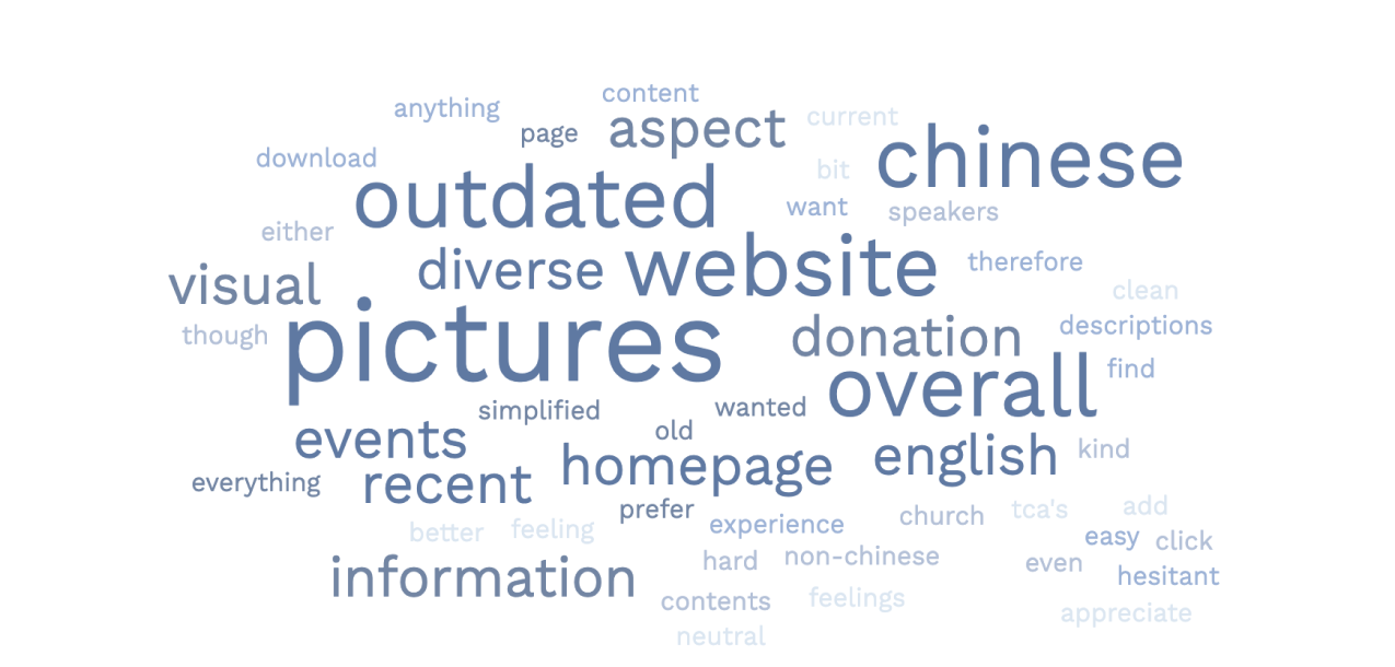
word cloud of repeated mentioned problems of the original TCA website from feedbacks gathered via user interviews.
TCA project analysis

Analysis

ICON - BUBBLE asset details
Observation & Insights
Using affinity mapping, interview codes and interesting quotes were categorized into 5 groups, revealing key pain points such as difficulties in finding announcements and making online donations. Surprisingly, the lack of an English page emerged as a common concern, even among Chinese speakers, emphasizing the need for a broader international focus. Therefore, it became crucial to ensure the accommodation of dual languages and improved accessibility for different geographical regions. Additionally, negative sentiments expressed by interviewees were tied to the perception of the website being outdate, leading to a lack of trust and negative first impressions. Improving the user experience by addressing outdated perceptions became a crucial objective.
ICON - BUBBLE handshake
Meet Heather and Dylan
Heather, a current church member seeking information, announcements, and upcoming events on the website. Heather’s persona embodies the pain points of usability and information organization derived from the interviews. Now, let’s introduce Dylan, a tech-savvy individual whose primary goal is to watch sermon videos online. Dylan’s persona encompasses concerns and goals expressed by both the interviewees and stakeholders.
I created two user journey maps based on the personas. The first map follows Heather’s journey to find new announcements and upcoming events on the website. The second map illustrates Dylan’s journey to locate a Sunday sermon video. These maps highlight their key interactions and steps in achieving their respective goals.

How Might We Questions

How might we reduce user confusion on the church’s website?
How might we establish trust with first-time visitors on the church’s website?
How might we increase users' interest when accessing the church’s website?
How might we make the website more inclusive for a diverse audience?
How might we increase users’ “control” over online sermon videos on the church’s website?

User Flow

TCA website user flow 1
ICON-BUBBLE cursor
Checking Announcements & Upcoming Events
Checking announcements and upcoming events emerged as the primary motivation for using a church website. However, considering TCA’s status as a smaller local church with fewer events, the stakeholder expressed concerns about using excessive space on the homepage for announcements. To address these considerations, I aimed to design a solution that effectively incorporates announcements without overwhelming the homepage or occupying excessive space.
TCA website user flow 5
ICON-BUBBLE cursor
Changing Language
As an Asian American church that serves primarily Chinese-speaking and English-speaking individuals, it is important to offer both Chinese and English pages to accommodate diverse users. Ensuring seamless language switching is essential to create a user-friendly experience.
TCA website user flow 3
ICON-BUBBLE cursor
Giving Online Donation
Online donations ranked high as a motivation for users when accessing a church website. Thus, it is essential to design a user-friendly and straightforward pathway for users to make online donations directly from the website.
TCA website user flow 4
ICON-BUBBLE cursor
Watching Sunday Sermon Videos
One of the top services the stakeholder wanted to focus on was providing easy access to our church’s sermon videos. Users in the U.S. and other countries preferred accessing sermon videos through YouTube, while users in China required alternative options due to restricted access to certain platforms. Therefore, the design should incorporate a dual approach, directing most users to YouTube links while providing prominent download buttons for those with limited website accessibility.
TCA website user flow 2
ICON-BUBBLE cursor
Connecting with the Church
By incorporating contact forms on the website, new visitors can quickly reach out and leave messages, ensuring prompt responses to their inquiries.
TCA website sketches
TCA website laptop mock - guerilla testing
ICON-BUBBLE create
Guerilla Testing
Red routes’ low-fidelity mockups were initially created and tested with the stakeholder to provide a visual representation and gather feedback.
And by using the Marvel App, I performed a Guerilla Usability Testing to roughly see if there’s any confusion or problem with the flow for one of the red routes.

From Paper to Figma

ICON-BUBBLE create
Low to High-Fidelity Mockups
After that was done, I proceeded with creating digital wireframes using Figma.
Once approved, the color palette, typography, and iconography were established, leading to the design of high-fidelity screens. Additionally, edge cases like extremely long comments for the fill-out form were also considered and incorporated into the mockups.
TCA Website low-fidelity wireframeTCA Website design systemTCA website high-fidelity mockups

Before vs. After

Below are some before (left) and after (right) comparisons of TCA’s original website and our new mockup, especially for our key five red routes.
ICON-BUBBLE hand cursor
Homepage / Announcement Page
For our homepage, some of the key features we changed were the carousel picture, featured videos section, donation section, and connect with us section. We wanted to keep the screen clean and less crowded, and to provide more straightforward CTA buttons. Additionally, we incorporated our announcements in the carousel section in order to provide users with the latest information, and not take up too much space with a dedicated section knowing it wasn’t our church’s main focus.
ICON-BUBBLE hand cursor
Chinese English Page
In the original website, there wasn’t a tab or a way to link to an English page. Thus, we added the English tab on the very right in the navigation bar in order to welcome a broader international target audience.
ICON-BUBBLE hand cursor
Sunday Sermon Video Page
For our Sunday sermon page, one key change we made was to offer a direct YouTube link to the videos in addition to the video/audio/text download buttons. This allows users in different geographic regions to access the sermon videos more conveniently based on their personal preferences.
ICON-BUBBLE hand cursor
Online Donation Page
In the original donation page, there wasn’t any link that can direct users to perform online donations while visiting the website. Thus, we added some CTA buttons that can provide users to access online donation. Other than that, we also added more visuals on this page.
ICON-BUBBLE hand cursor
Connect With Us Page
In the original website, there wasn’t a dedicated page that allows new users to connect with the church staffs. Thus, in this new page, we provided a form for new visitors to fill out for any comment/questions they might have for the church.

Prototype

Behind the Scenes

We recruited 5 participants to participate in our usability testing, and 2 major issues were found through the interview.
ICON-BUBBLE question mark
Issue 1 - Confusing 2 Primary Colors
Several rounds of iterations and refinements were taken during the design process. An example of this is the homepage, where initially 2 different colors were used for the primary buttons. However, through reviews and user feedback, it was discovered that this inconsistency could lead to user confusion. By revisiting the 60-30-10 color rule and considering task importance, the decision was made to use a solid burnt orange color for the primary button and a blue outlined design for the secondary button.
“Not sure which button was more important...”  - participant 3
changes in TCA high-fidelity homepage mockup, before and after
We recruited 5 participants to participate in our usability testing, and 2 major issues were found through the interview.
ICON-BUBBLE question mark
Issue 2 - Low Access Rate
Another big alteration was the landing pages. Initially, the decorative wording was placed in the middle with the subpage’s button following below. The intention was to add animation to attract users’ attention and encourage scrolling. However, feedback from the users showed that only 1 out of 5 participants actually clicked onto the landing page, and it wasn’t her intuitive navigation either. To address this, the landing pages were removed, allowing users to directing click into the subpages instead.
“I won’t click onto that page intuitively.”  - participant 1

From Paper to Figma

TCA website final mockup 2

Behind the Scenes

ICON-BUBBLE trust
Team Communication
As my first project, it provided valuable real-life experience in navigating the design-to-development handoff process and collaborating within a team comprising the stakeholder, project manager, and developer. I learned the importance of proactive communication with the developer for design-related queries, conducted regular meetings with the stakeholder to ensure alignment with their vision, and kept an ongoing spreadsheet for tracking questions and comments to discuss with the project manager. This approach facilitated progress tracking and allowed me to learn and grow from every iteration.
ICON-BUBBLE geography
Designing for a Global Community
One fascinating aspect of this experience was designing for a global audience, which involved addressing two key considerations. Firstly, catering to a multilingual audience, including Chinese and English speakers, required designing a layout that accommodates both languages effectively. Secondly, our target audience extended beyond the United States, encompassing individuals from countries like Taiwan and China. Considering the limited accessibility to certain internet platforms in China, such as YouTube, it was crucial to develop designs that could accommodate diverse user needs and preferences.
ICON-BUBBLE alarm clock
Design is An Ongoing Process
Contrary to what I learned in courses, working on real-life UX/UI projects revealed that the process is continuous and cyclical. I often found myself going back and forth between research and design to make even minor adjustments. Through review feedback and user testing, I embraced the mindset of consistently improving the quality of my designs. I realized that perfection is not a fixed endpoint but an ongoing journey of adaptability, observation, and striving to bring the design closer to the team’s vision.