ICON iOS16 chevron
FeastPass - Mockup

The Introduction

ICON-BUBBLE literature
Overview
FeastPass is a community engagement platform designed to seamlessly connect users with local gems, including food vendors, coffee shops, restaurants and beyond! In the pursuit of enhancing user experience, our focus in this project was on the development of a mobile app, ensuring a delightful journey for members from the captivating loading page to effortlessly accessing each vendor’s profile.
ICON-BUBBLE user groups
Stakeholders
Being a part of a design team with two other designers, we partnered up with FeastPass, a startup based in Austin, TX. At the heart of their mission is the creation of a platform designed to connect customers with their neighborhood restaurants and local street food & beverage vendors.
ICON-BUBBLE laptop
My Role
This project showcased my ability to conduct user research, establish a design system, and craft wireframes and prototypes along with two other designer teammates. Through iterative feedback and multiple rounds of meetings, we worked in collaboration within a tight 4-week timeframe to complete our tasks, and aligning our final deliverables with the expectations of both stakeholders and end-users.
FeastPass - Kick Off information

Problem Statement

ICON-BUBBLE meeting
Kick-Off!
Our initial kick-off call provided us with a comprehensive grasp of the project’s entirety, including the stakeholders’ envisioned inspirations, and their expectations for our final deliverable.
ICON-BUBBLE folder
Ultimate Goal
After conducting their beta-test and having the basic website structure laid out, FeastPass now wanted to explore the development of a mobile application, establishing an MVP for the app. The ultimate goal was to create a high-fidelity consumer-facing app mockup using the iPhone 14 model, with multiple pages supporting the functionalities listed above.
FeastPass - Progress

What the Users Want?

ICON-BUBBLE laptop
Competitive Analysis & User Interviews
We wanted to understand what exactly the users’ expectations are as well as their behavioral habits with dining/taking-out/collecting rewards, therefore, we conducted 6 user interviews, grasping their likes and dislikes. Additionally, I also performed a competitive analysis to take notes on some features we like and dislike, examining similar functionality products in the industry, such as Ritual, The Nudge, and Camper.
FeastPass - User Interview Pain Points
up chevron grey
interesting quotes of the interviewees from the user interviews

Analysis

ICON - BUBBLE handshake
Observation & Insights
Through affinity mapping, we identified the top pain points from the users, and grouped them into these two User Stories:

“As a local business customer, I want to easily discover and access deals and discounts offered by local vendors so that I can save money while enjoying their products or food."

”As a local business customer, I want to centralize all my loyalty coupons in one location for the convenience of having them readily available so that I prevent losing or forgetting to use them.”
ICON - BUBBLE handshake
Meet Lily
Meet Alex and Jennifer! They are two personas generated based on the two user stories mentioned above.
Their user journey maps were also created in order to resonate with the users’ experience when expectations fell through as they are performing their actions.
FeastPass - Persona #1FeastPass - Persona #2FeastPass - Customer Journey Map #1FeastPass - Customer Journey Map #2

How Might We Questions

Based on the persona and some of the key highlights from the research findings, we ended up with these two How Might We questions in addition to the sign-up process, serving as a guide for addressing user needs and shaping the direction of the project.
1. How might we notify the users with the deals with local vendors?
2. How might we make the members to use loyalty program with more ease and convenience?

Ideation

ICON-BUBBLE cursor
User Flow
After we established what our How Might We questions are for this project, we went ahead and drafted out our 3 main red routes:
1. Start membership/Sign-up process
2. Searching for nearby events, and inviting friends to that event
3. Saving coupons in coupon book
FeastPass User FlowsFeastPass - Sketches

1st Round of Iteration

ICON-BUBBLE cursor
User Flow
Because of the time constraint, we went over our initial flow with our stakeholders, trying to make sure that our drafts were align with their thoughts. One major updates we got from this iteration was the structure of our third flow. We initially had “electronic punch cards” in mind when it comes to collecting rewards. However, the stakeholders preferred to adapt the “enter code for discount activation” method. The updated designs were then drafted out as our low-fidelity wireframes.
1st Round of Iteration

From Paper to Figma

ICON-BUBBLE create
Design Systems & High-Fidelities
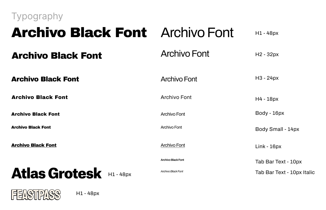
After having the flows laid out, I started working on our design systems for this project, identifying the typographies, the brand’s primary and secondary colors, the icon sets that reflects the brand identity, as well as the specifications of the design (such as the width of borders and strokes, and layout grid etc.)
Design System - TypographyDesign System - Color PaletteDesign System - SpecificationsFeastPass - High-fidelity mockups

Peak Into the Solutions

Behind the Scenes

After creating the prototype, we recruited a total of 6 participants to assess the following in the user testing:

1. 3 User Flows: understanding if the users are able to successfully navigate through the 3 red routes we listed out as our MVP.
2. Hierarchy: with some additional screens designed, we wanted to test if the placement and the hierarchy of the functions is user-friendly as well.
2nd Round of Iteration - #1
ICON-BUBBLE messaging
Feedback 1 - Introduction Pages
Most participants expressed that the “introduction pages” were helpful, however, they were a bit too long and 4 out of 6 participants expressed that they would like to have just 1 intro page, and then go directly to the sign-up process. With this feedback, we decided to consolidate the 3 introduction pages into one page since the original pages were repetitive with the same information.
“I wish I could skip to the sign-up part so I can learn about the actual product more”  - participant 3
2nd Round of Iteration - #2
ICON-BUBBLE messaging
Feedback 2 - Sign-Up Pages
All 6 participants expressed that on the original sign-up page, not only the font of the information was way too small to read, but there were too much given on one page and it seemed a bit overwhelming.In our edits, we decided to increase the font sizes, with 10px being our smallest font size. Additionally, we decided to separate the information into two pages. The first one would only have the subscription benefits information, while the other page providing different subscription plans.
“This page is so overwhelming... I can’t read the words, and there’s so much going on...”  - participant 5
2nd Round of Iteration - #3
ICON-BUBBLE messaging
Feedback 3 - Hamburger Menu/Profile/Placements
Out of all 6 participants, almost everyone had trouble locating the “events” page in the original design. The first reason was that the hamburger menu was not observant enough, some participants mentioned their initial thought process would be looking through the bottom navigation bar first. The second reason was that the title “experiences” was not intuitive enough for users to connect its meaning to “events”.One major edit we did was to update the placement of the subpages from the original menu overlay. We removed the hamburger menu icon, and moved the Events tab to the bottom so that it could be more easily accessible. Next, the Notification and Settings icons were placed on the top right,  with the “contact us” tab being stored under Settings. Lastly, we moved all Account Settings related tabs under Profile, including Wallet and Invite Friends, etc.
“My first thought reaction was to look here to find the ‘events’ tab, but I wasn’t able to find it”  - participant 5

Key Takeaways

ICON-BUBBLE heart key
Team Communication
Through this project, I had the opportunity to work with other designers, and one major takeaway I got was the importance of communicating. I love working with a team. Team dynamics, particularly when fueled by diverse creative perspectives, have the power to birth something extraordinary and unprecedented through thoughtful discussions and brainstorming sessions. And the key to a good teamwork is definitely good communication skills. Throughout the process, we got to work through and combine everyone's opinions together based on our different skillsets, creating a rewarding experience and amazing deliverables.
ICON-BUBBLE heart key
Meeting in the Middle Ground
Through this experience, I also honed the skill of navigating the delicate balance between stakeholders’ expectations and users’ desires. As designers, we often find ourselves as the bridge between these two realms, and discovering innovative solutions that harmonize these divergent perspectives became a fascinating aspect of my work during this project.